
- Posts: 10
- Thank you received: 0
Still re size problems
8 years 8 months ago #29120
by fortza
Replied by fortza on topic Still re size problems
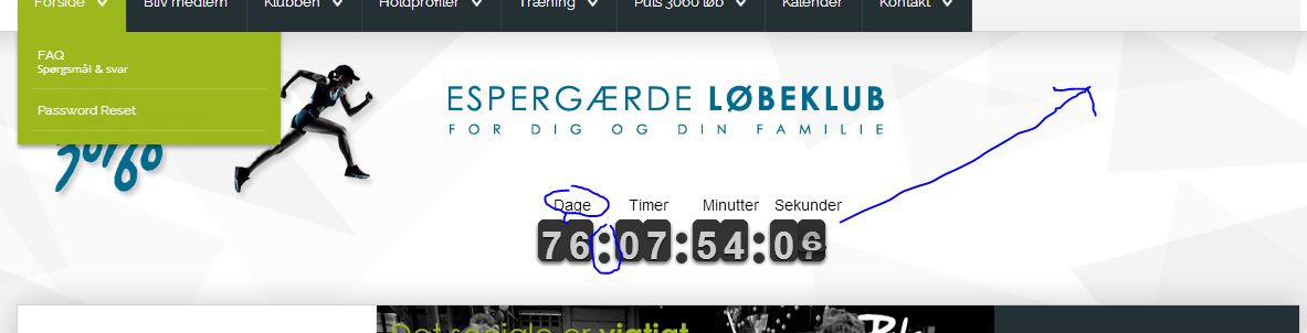
Well, it's proberly me doing it all wrong - the hight is wrong, the dot is wrong, and I can't get it in the "Banner position" - see my attached pic.
Please Log in or Create an account to join the conversation.
8 years 8 months ago - 8 years 8 months ago #29121
by fortza
Replied by fortza on topic Still re size problems
Hi again,
It seems like that I can't change your modul as I have hoped - I will try and keep it as it is, but how do I change the main text/headline - I also want the headline to be center
.....and, is it also possible to set in a link, I want to link to the event.
It seems like that I can't change your modul as I have hoped - I will try and keep it as it is, but how do I change the main text/headline - I also want the headline to be center
.....and, is it also possible to set in a link, I want to link to the event.
Last edit: 8 years 8 months ago by fortza.
Please Log in or Create an account to join the conversation.
- nordmograph
-
- Offline
- Moderator
-

Less
More
- Posts: 15247
- Thank you received: 1067
8 years 8 months ago #29134
by nordmograph
- Need help? Post the URL of the related page (eventualy as confidential info), it will help solve your issue faster.
- An error, notice or warning? report the exact message including the line number
- If you get a white page , enable error reporting and / or check your server error logs.
Replied by nordmograph on topic Still re size problems
Well it goes below because there is not enough space in there for it to fit yet.
reduce the font size in
.flip-clock-wrapper ul li a div div.inn
for the points,
tweak this
.flip-clock-dot.top {
top: 25px;
}
I recommend you use Google Chrome 's right click inspect feature to edit the css live and then apply your successfull edits to the stylesheet.
Nothing is impossible but to put a link on the counter you'll have to edit the code.
in the default.php file
- Need help? Post the URL of the related page (eventualy as confidential info), it will help solve your issue faster.
- An error, notice or warning? report the exact message including the line number
- If you get a white page , enable error reporting and / or check your server error logs.
Please Log in or Create an account to join the conversation.
8 years 8 months ago #29171
by fortza
Replied by fortza on topic Still re size problems
Hi again,
Well, it's VERY tricky getting this modul working properly, my surgestion to further improvement is that you need to have ALL these ajustment inside your modul. A simple one could be, whit in your modul to have a posibillity to set a web link.
Please see my attached pic. where and how do I change the aligment of the hedaline, and also.....why is the aligment of fx. days, hours ect. not center ?
Best regards, Fortza
www.puls3060.dk
Please Log in or Create an account to join the conversation.
- nordmograph
-
- Offline
- Moderator
-
Less
More
- Posts: 15247
- Thank you received: 1067
8 years 8 months ago - 8 years 8 months ago #29174
by nordmograph
- Need help? Post the URL of the related page (eventualy as confidential info), it will help solve your issue faster.
- An error, notice or warning? report the exact message including the line number
- If you get a white page , enable error reporting and / or check your server error logs.
Replied by nordmograph on topic Still re size problems
Hi
Well it would be hard to add any paramater to the module settings for each of the css adjustments one would want to have for this module.
Css stylesheet files are there for this purpose allready.
For the center issue , set this for the "right" in
flipclock.css line 201
flipclock.css line 210
flipclock.css line 213
for the headline not aligned edit line 1
(edit: in style.css)
Hope it helps
Well it would be hard to add any paramater to the module settings for each of the css adjustments one would want to have for this module.
Css stylesheet files are there for this purpose allready.
For the center issue , set this for the "right" in
flipclock.css line 201
Code:
.flip-clock-divider .flip-clock-label {
position: absolute;
top: -1.5em;
right: -37px;
color: black;
text-shadow: none;
text-align: center;
}
flipclock.css line 210
Code:
.flip-clock-divider.minutes .flip-clock-label {
right: -60px;
}
flipclock.css line 213
Code:
.flip-clock-divider.seconds .flip-clock-label {
right: -45px;
}
(edit: in style.css)
Code:
#countdownwrapper {
/* text-align: center; */
}
Hope it helps
- Need help? Post the URL of the related page (eventualy as confidential info), it will help solve your issue faster.
- An error, notice or warning? report the exact message including the line number
- If you get a white page , enable error reporting and / or check your server error logs.
Last edit: 8 years 8 months ago by nordmograph.
Please Log in or Create an account to join the conversation.
8 years 8 months ago #29175
by fortza
Replied by fortza on topic Still re size problems
Hi,
Thanks for your always fast reply - this is my CSS, I think I have done something wrong here :
/* Get the bourbon mixin from bourbon.io */
/* Reset */
#countdownwrapper {
/* text-align: center; */
}
.flip-clock-wrapper * {
-webkit-box-sizing: border-box;
-moz-box-sizing: border-box;
-ms-box-sizing: border-box;
-o-box-sizing: border-box;
box-sizing: border-box;
-webkit-backface-visibility: hidden;
-moz-backface-visibility: hidden;
-ms-backface-visibility: hidden;
-o-backface-visibility: hidden;
backface-visibility: hidden;
}
.flip-clock-wrapper a {
cursor: pointer;
text-decoration: none;
color: #ccc; }
.flip-clock-wrapper a:hover {
color: #fff; }
.flip-clock-wrapper ul {
list-style: none; }
.flip-clock-wrapper.clearfix:before,
.flip-clock-wrapper.clearfix:after {
content: " ";
display: table; }
.flip-clock-wrapper.clearfix:after {
clear: both; }
.flip-clock-wrapper.clearfix {
*zoom: 1; }
/* Main */
.flip-clock-wrapper {
font: normal 18px "Helvetica Neue", Helvetica, sans-serif;
-webkit-user-select: none; }
.flip-clock-meridium {
background: none !important;
box-shadow: 0 0 0 !important;
font-size: 18px !important; }
.flip-clock-meridium a { color: #97b639; }
.flip-clock-wrapper {
text-align: center;
position: relative;
width: 100%;
margin: 1em;
}
.flip-clock-wrapper:before,
.flip-clock-wrapper:after {
content: " "; /* 1 */
display: inline-table; /* 2 */
}
.flip-clock-wrapper:after {
clear: both;
}
/* Skeleton */
.flip-clock-wrapper ul {
position: relative;
float: left;
margin: 5px;
width: 26px;
height: 44px;
font-size: 36px;
font-weight: bold;
line-height: 87px;
border-radius: 5px;
background: #000;
}
.flip-clock-wrapper ul li {
z-index: 1;
position: absolute;
left: 0;
top: 0;
width: 100%;
height: 100%;
line-height: 50px;
text-decoration: none !important;
}
.flip-clock-wrapper ul li:first-child {
z-index: 2; }
.flip-clock-wrapper ul li a {
display: block;
height: 100%;
-webkit-perspective: 200px;
-moz-perspective: 200px;
perspective: 200px;
margin: 0 !important;
overflow: visible !important;
cursor: default !important; }
.flip-clock-wrapper ul li a div {
z-index: 1;
position: absolute;
left: 0;
width: 100%;
height: 50%;
font-size: 80px;
overflow: hidden;
outline: 1px solid transparent; }
.flip-clock-wrapper ul li a div .shadow {
position: absolute;
width: 100%;
height: 100%;
z-index: 2; }
.flip-clock-wrapper ul li a div.up {
-webkit-transform-origin: 50% 100%;
-moz-transform-origin: 50% 100%;
-ms-transform-origin: 50% 100%;
-o-transform-origin: 50% 100%;
transform-origin: 50% 100%;
top: 0; }
.flip-clock-wrapper ul li a div.up:after {
content: "";
position: absolute;
top: 44px;
left: 0;
z-index: 5;
width: 100%;
height: 3px;
background-color: #97b639;
background-color: rgba(0, 0, 0, 0.4); }
.flip-clock-wrapper ul li a div.down {
-webkit-transform-origin: 50% 0;
-moz-transform-origin: 50% 0;
-ms-transform-origin: 50% 0;
-o-transform-origin: 50% 0;
transform-origin: 50% 0;
bottom: 0;
border-bottom-left-radius: 6px;
border-bottom-right-radius: 6px;
}
.flip-clock-wrapper ul li a div div.inn {
position: absolute;
left: 0;
z-index: 1;
width: 100%;
height: 200%;
color: #ccc;
text-shadow: 0 1px 2px #000;
text-align: center;
background-color: #243034;
border-radius: 6px;
font-size: 35px; } /*font size*/
.flip-clock-wrapper ul li a div.up div.inn {
top: 0; }
.flip-clock-wrapper ul li a div.down div.inn {
bottom: 0; }
/* PLAY */
.flip-clock-wrapper ul.play li.flip-clock-before {
z-index: 3; }
.flip-clock-wrapper .flip { box-shadow: 0 2px 5px rgba(0, 0, 0, 0.7); }
.flip-clock-wrapper ul.play li.flip-clock-active {
-webkit-animation: asd 0.5s 0.5s linear both;
-moz-animation: asd 0.5s 0.5s linear both;
animation: asd 0.5s 0.5s linear both;
z-index: 5; }
.flip-clock-divider {
float: left;
display: inline-block;
position: relative;
width: 20px;
height: 52px; }
.flip-clock-divider:first-child {
width: 0; }
.flip-clock-dot { /*these are the dots*/
display: block;
background: #323434;
width: 10px;
height: 10px;
position: absolute;
border-radius: 50%;
box-shadow: 0 0 5px rgba(0, 0, 0, 0.5);
left: 5px; }
.flip-clock-divider .flip-clock-label {
position: absolute;
top: -1.5em;
right: -37px;
color: black;
text-shadow: none;
text-align: right;
}
.flip-clock-divider.minutes .flip-clock-label {
right: -60px; }
.flip-clock-divider.seconds .flip-clock-label {
right: -45px; }
.flip-clock-dot.top {
top: 30px; }
.flip-clock-dot.bottom {
bottom: 28px; }
@-webkit-keyframes asd {
0% {
z-index: 2; }
20% {
z-index: 4; }
100% {
z-index: 4; } }
@-moz-keyframes asd {
0% {
z-index: 2; }
20% {
z-index: 4; }
100% {
z-index: 4; } }
@-o-keyframes asd {
0% {
z-index: 2; }
20% {
z-index: 4; }
100% {
z-index: 4; } }
@keyframes asd {
0% {
z-index: 2; }
20% {
z-index: 4; }
100% {
z-index: 4; } }
.flip-clock-wrapper ul.play li.flip-clock-active .down {
z-index: 2;
-webkit-animation: turn 0.5s 0.5s linear both;
-moz-animation: turn 0.5s 0.5s linear both;
animation: turn 0.5s 0.5s linear both; }
@-webkit-keyframes turn {
0% {
-webkit-transform: rotateX(90deg); }
100% {
-webkit-transform: rotateX(0deg); } }
@-moz-keyframes turn {
0% {
-moz-transform: rotateX(90deg); }
100% {
-moz-transform: rotateX(0deg); } }
@-o-keyframes turn {
0% {
-o-transform: rotateX(90deg); }
100% {
-o-transform: rotateX(0deg); } }
@keyframes turn {
0% {
transform: rotateX(90deg); }
100% {
transform: rotateX(0deg); } }
.flip-clock-wrapper ul.play li.flip-clock-before .up {
z-index: 2;
-webkit-animation: turn2 0.5s linear both;
-moz-animation: turn2 0.5s linear both;
animation: turn2 0.5s linear both; }
@-webkit-keyframes turn2 {
0% {
-webkit-transform: rotateX(0deg); }
100% {
-webkit-transform: rotateX(-90deg); } }
@-moz-keyframes turn2 {
0% {
-moz-transform: rotateX(0deg); }
100% {
-moz-transform: rotateX(-90deg); } }
@-o-keyframes turn2 {
0% {
-o-transform: rotateX(0deg); }
100% {
-o-transform: rotateX(-90deg); } }
@keyframes turn2 {
0% {
transform: rotateX(0deg); }
100% {
transform: rotateX(-90deg); } }
.flip-clock-wrapper ul li.flip-clock-active {
z-index: 3; }
/* SHADOW */
.flip-clock-wrapper ul.play li.flip-clock-before .up .shadow {
background: -moz-linear-gradient(top, rgba(0, 0, 0, 0.1) 0%, black 100%);
background: -webkit-gradient(linear, left top, left bottom, color-stop(0%, rgba(0, 0, 0, 0.1)), color-stop(100%, black));
background: linear, top, rgba(0, 0, 0, 0.1) 0%, black 100%;
background: -o-linear-gradient(top, rgba(0, 0, 0, 0.1) 0%, black 100%);
background: -ms-linear-gradient(top, rgba(0, 0, 0, 0.1) 0%, black 100%);
background: linear, to bottom, rgba(0, 0, 0, 0.1) 0%, black 100%;
-webkit-animation: show 0.5s linear both;
-moz-animation: show 0.5s linear both;
animation: show 0.5s linear both; }
.flip-clock-wrapper ul.play li.flip-clock-active .up .shadow {
background: -moz-linear-gradient(top, rgba(0, 0, 0, 0.1) 0%, black 100%);
background: -webkit-gradient(linear, left top, left bottom, color-stop(0%, rgba(0, 0, 0, 0.1)), color-stop(100%, black));
background: linear, top, rgba(0, 0, 0, 0.1) 0%, black 100%;
background: -o-linear-gradient(top, rgba(0, 0, 0, 0.1) 0%, black 100%);
background: -ms-linear-gradient(top, rgba(0, 0, 0, 0.1) 0%, black 100%);
background: linear, to bottom, rgba(0, 0, 0, 0.1) 0%, black 100%;
-webkit-animation: hide 0.5s 0.3s linear both;
-moz-animation: hide 0.5s 0.3s linear both;
animation: hide 0.5s 0.3s linear both; }
/*DOWN*/
.flip-clock-wrapper ul.play li.flip-clock-before .down .shadow {
background: -moz-linear-gradient(top, black 0%, rgba(0, 0, 0, 0.1) 100%);
background: -webkit-gradient(linear, left top, left bottom, color-stop(0%, black), color-stop(100%, rgba(0, 0, 0, 0.1)));
background: linear, top, black 0%, rgba(0, 0, 0, 0.1) 100%;
background: -o-linear-gradient(top, black 0%, rgba(0, 0, 0, 0.1) 100%);
background: -ms-linear-gradient(top, black 0%, rgba(0, 0, 0, 0.1) 100%);
background: linear, to bottom, black 0%, rgba(0, 0, 0, 0.1) 100%;
-webkit-animation: show 0.5s linear both;
-moz-animation: show 0.5s linear both;
animation: show 0.5s linear both; }
.flip-clock-wrapper ul.play li.flip-clock-active .down .shadow {
background: -moz-linear-gradient(top, black 0%, rgba(0, 0, 0, 0.1) 100%);
background: -webkit-gradient(linear, left top, left bottom, color-stop(0%, black), color-stop(100%, rgba(0, 0, 0, 0.1)));
background: linear, top, black 0%, rgba(0, 0, 0, 0.1) 100%;
background: -o-linear-gradient(top, black 0%, rgba(0, 0, 0, 0.1) 100%);
background: -ms-linear-gradient(top, black 0%, rgba(0, 0, 0, 0.1) 100%);
background: linear, to bottom, black 0%, rgba(0, 0, 0, 0.1) 100%;
-webkit-animation: hide 0.5s 0.3s linear both;
-moz-animation: hide 0.5s 0.3s linear both;
animation: hide 0.5s 0.2s linear both; }
@-webkit-keyframes show {
0% {
opacity: 0; }
100% {
opacity: 1; } }
@-moz-keyframes show {
0% {
opacity: 0; }
100% {
opacity: 1; } }
@-o-keyframes show {
0% {
opacity: 0; }
100% {
opacity: 1; } }
@keyframes show {
0% {
opacity: 0; }
100% {
opacity: 1; } }
@-webkit-keyframes hide {
0% {
opacity: 1; }
100% {
opacity: 0; } }
@-moz-keyframes hide {
0% {
opacity: 1; }
100% {
opacity: 0; } }
@-o-keyframes hide {
0% {
opacity: 1; }
100% {
opacity: 0; } }
@keyframes hide {
0% {
opacity: 1; }
100% {
opacity: 0; } }
.flip-clock-label{
font-size: 14px;
}
Please Log in or Create an account to join the conversation.
Time to create page: 0.374 seconds
Shop Account
Follow Us
Disclaimer: Nordmograph is not affiliated with or endorsed by The Joomla! Project™. Any products and services provided through this site are not supported or warrantied by The Joomla! Project or Open Source Matters, Inc. Use of the Joomla!® name, symbol, logo and related trademarks is permitted under a limited license granted by Open Source Matters, Inc.
Copyright © 2024 Nordmograph - Joomla extensions. All Rights Reserved.
Joomla! is Free Software released under the GNU General Public License.
